Author: gsdesign1

Web Design Part 4 – Do you need an Intranet?

First off, let me begin by saying thanks to anyone who reads these posts on my blog. That’s right, thanks to both of you.

So, the other day I was thinking about the Internet, and also, what an intranet is. It seems a lot of people don’t know really what an intranet is, or if they need one. So hopefully by the end of this blog post I’ve explained what one is, why some companies need them while others don’t, and what they should be used for, though there’s a lot more ideas than I could probably come up with in one sitting, and that’s why I believe in working with like-minded creative and business individuals in order to make something that works well for everyone. Unfortunately we all know not everyone will get the same benefit from any website, product or service that someone else would, no matter how hard you try to make that happen — thus the story of the committee and the camel.

To start, the thing we use all day long – the World Wide Web, runs on the Internet, which most people know. The network (Internet) that every Tom, Dick and Harry has access to to get to websites, ftp files, and so on, runs pretty much on an unprotected network that everyone has access to — thus the issue with sensitive data, and the need for secure (HTTPS) websites when doing things like paying bills on-line.  That’s one reason why corporations and governments started using intranets — secure networks that only their employees have access to, either from within their corporate offices, or from home by logging in with secure access via some sort of password and digital key FOB.

Little known to most of the public, the internet as we know it today was originally the first intranet, designed to allow universities and the government to send files back and forth as well as email each other, way before the Swedes came up with HTML and the idea of the World Wide Web. Yes, there was an internet before Al Gore invented it, though there is some evidence he did invent Bill Gates…

Turn to many years later, and you have everyone using the Internet — for email, getting on the web, sharing photos, transferring files, and even making phone calls.  So, companies and the governments needed a way to have email, file transferring, and sharing information not intended for the public away from the public. Thus the inTRAnet. Which even to this day I hear people in IT who should know the difference between that and the inTERnet continue to confuse. The question is, does your company need an intranet?

First, is your company less than 50 people? Than you really don’t need an intranet.
Does your company have a whole ton of people, spread out over a region in different offices? Then you do need an intranet.  Yes, I know that’s pretty basic math, and there are a whole lot of other reasons to have one, but that’s for you and your IT and business people to figure out.

So, among most of the reasons to have your own intranet would be:
1. Secure email solution
2. Posting of company information, including all the communications to the employees to keep them abreast of new things happening, how to get benefits and changes in those, upcoming meetings, videos of the CEO or President giving his quarterly speech, a company wide directory, and so on and so on. The point being is instead of mailing all this information to your employee’s homes, it’s all on your company intranet website, also known as an employee portal.
3. Secure file transfers to your servers.
4. Secure file transfers to each other.

And I could go on as more things come to me. Just remember that a good intranet website shouldn’t end up becoming a camel, and then you’ll have a great communications tool for you and your employees.

Website Design Part 3 – When big sites won’t work

I’m going to keep this pretty short and simple. Any website should work once it’s launched into the real world, especially if you’re company is a multimillion dollar entity whose online image affects their own bottom dollar.

Case in Point: Sony Electronics. More to the point, there online job search, or careers section. There were a few jobs there I’m VERY interested in, so I pop on over, put in what I’m looking for, what state, what city, click Submit — nothing. No response. No turning wheels, no progress bar in the browser, Nada, zip, zilch.

Now, to be fair, I’m on a Mac. I tried Safari, then Firefox. Still nothing. My guess is they developed the site in Windows, tested in Windows, and left it at that. Which my second guess is they’re only looking to hire people who use Windows.

I’d like my friends, or those reading this, to try it on Windows and let me know if my assumption is true by going here: Sony Jobs. If it only works in IE, then I’m stumped. The positions are for designers – one is an associate Creative Director, another for a senior designer. I’m guessing there are more.  What stumps me is that the majority of people in web design, marketing design, advertising and so on, use Macs.

What this also tells me is they need way better web people who know that Windows users aren’t the only people using the web.  I used to work for the company that contracted with the County of San Diego on their website. When I came on, the requirements were to make the sites only compatible for IE 5.2 then eventually IE 6. So, any San Diegans who used Macs that needed County based services (like paying taxes online, getting property information, or checking on current votes during an election), were pretty much considered second class citizens. That is until enough complained to elected officials. Then the county sites became Mac friendly, in order for those officials not to lose the valuable votes.

Now if could only get big corporations to feel the same way about consumer’s dollars that elected officials feel about citizen’s votes when it comes to the web.

Web Design Part 2 – Color

There seems to be a lot of people who like to design web sites, and or anything else, that don’t understand color theory. Let it be known that knowing color is very important in any design work, whether web, logos, print, even painting your house or office – if they let you have more than white walls or are stuck in a cube. I just came from an office that was an endless sea of gray cubes, with very cool spectrum lighting. Perfect for programmers and engineers, horrible for designers/creative types.

There are 6 separate color themes, all based on what’s called a color wheel. The color wheel is a pretty good representation of color theory. If you have any good paint program like Photoshop, Corel Painter (that has a very nice one), you know what the color wheel is. Even Mac’s come with one built in with tons of features. This is what one looks like:

color-wheel1

Or go to your local art supply store and buy one. They’re fun and cool to have around, and look like this:colorwheel

Plus, your friends will ask what it is. Make sure you put it next to a really sharp xacto knife, a straight edge, and a hand waxer (used for paste-up, way before cut and paste on computers), and then you’ll have some great conversation pieces. Just make sure you keep your thumb or fingers out of the way when showing how it all works. Trust me.

I can type up a whole lesson on color theory, but I suggest you Google it, or check out this site which I like a lot: Color Wheel Pro: Color Theory Basics.

Website Design Part One – the number 3

It seems these days everyone and their mother are making websites, blogging, Twittering, Facebooking, etc. I subscribe to the school of thought that although anyone can make a website, not everyone can make a great website, nor knows how to. There are a lot of tools that allow anyone to create a site, yet not everyone has the design sense — visually or usably, to make a site work well.

not everyone has the design sense — visually or usably, to make a site work well.

There are a few things every web designer should know when creating a site that they want actual people to use. This applies for not just the layout, or navigation, but graphics as well, and it has to do with the number 3 in this installment of Website Design.

The number 3 is important — so important that we as humans rely on it without realizing it. The Christian Faith knows it as the Holy Trinity; artists, designers, photographers know it as the Rule of Thirds; there’s the old saying “Third time’s a charm”, and so on. The example site I’m going to use hit it on the number 3, but when they went to the 4th revision, things didn’t go so well, and I’ll discuss what happened, and what one should avoid whenever working on a web site.

So, things that are important in website design with the number 3:

1: Navigation: Nothing should take more than 3 clicks to get to.

2. Visuals: Stick to the Rule of Thirds. If you don’t know it, Google it.

3. Put your most important and new stuff on the home page, and always keep content fresh. After all, no one returns to the grocery store if they have old fruit, do they?

First, the County of San Diego website, circa 1997. The first website where they gave some thought to the design. The site  did win 4th place for Best of the Web. There are 3 types of viewers the site needed to address: The citizens of the county, the employees of the county, and the businesses who did business with the county, also known as external entities, such as school districts, police agencies, foster programs and so on. In other words, things should be easy to access from the home page for anyone.

1997

and one of the department pages. Not as pretty, but still easy to use and to the point:

County2001

Not more than a few years later, the County of San Diego decided it was time for a redesign. Here it is in the second revision of the site, circa 2002. The changes site wide- gray background, shared header that tied all the department sites together, and all the departments used the same left hand navigation menu structure. Information on department pages could be found in 3 clicks or less. The biggest design flaw- the only branding was the header, footer, and left nav. Each department had their own look and feel inside their respective content areas, which I’ll show in the next site design.

2002

Third version of the County site, 2004. It was a new world in the web, new technologies came out, and the County decided to leverage a cool product called Oracle Portal for their home page. This allowed sections of the home page to be dynamically updated, being that each portal on it was it’s own entity.

The portal was user friendly, had a sharp design, services the public users needed to get to were easy to find, and there was always something new to see on the home page. The site won 1st place in the Digital Counties Survey among counties of 500,000 or more.  The site featured links to important things any of the 3 user types needed to get to right away. Need to pay property taxes? I t was there on the home page. Need to get your financial reports for your agency? The login for that was on the home page. Need to get employment info? That was on the home page as well, as well as other very useful info like traffic and weather.  Notice also the Rule of Thirds in the overall design as well as the header.

county2004

As cool as that was, departments still got their own look and feel, so branding wasn’t a super top priority:

oes

The site kept this design for quite a while, until 2007 rolled around. The County was ready to move to a new design, something cutting-edge, a fresh look and feel, something better, another award winner. At that time, they had been using Documentum, a document management system, for all County paperwork, records, etc. Documentum had a tool called Web Publisher, that allowed websites to be created without knowing any HTML, or so it advertised itself as such. Everything was templates, all sites would have the same look and feel department to department, branding would finally be in unity. The County would save huge amounts of money by not needing their IT contractor’s web designers or developers, they could get content up right away instead of in a few hours, and so on.

They decided to go with a 3rd party, and expert in Documentum, to help develop the new site. For the design, they decided to let one of their interns create the look and feel, working with content managers from the media department. Needless to say, none of them had any real web design experience. The team (my team) was pretty much left out in the cold on this one. Sure, we had to fix and redo everything the vendor created, but had to stay with the chosen look and feel. Our team of experts weren’t allowed to help on the design, whether visuals or usability. Things that were easy to find on the home page went missing, or were buried 4, 5, 6 clicks away. Also, the home page wouldn’t fit onto a user’s screen without scrolling (at 1920*1200). To see it live, go to http://www.sdcounty.ca.gov.   Try and find property tax payments on the home screen without doing a search.

county2009

About a month ago, the customer complained the site was ugly, not easy to use, things were hard to find, they were getting a lot of complaints. They want a new website.

So, what should they do? My suggestion is go back to the team that won them the awards. I do believe they should make the site branded so all departments keep the general look and feel. However, by thinking about the new tech toy instead of usability, they lost something in the process.

EVERYONE knows what a rocket looks like. But if you’re not a  rocket scientist,  you don’t know what makes a rocket truly work.

Earlier I mentioned not everyone has design sense, and basically that although there are plenty of tools to make a website, not everyone is a natural born web designer. If you take a group of folks, put them together in a room and tell them to design a new rocket, who by the way have zero rocket skills, you would end up with something that looks like a rocket — pointy nose, some fins, a round cylindrical shape, and the area where the flames shoot out the bottom. EVERYONE knows what a rocket looks like. But if you’re not a rocket scientist, you don’t know what makes a rocket truly work.

Same goes for websites. Sure, we all know what one looks like. But the average user has no idea what is under the hood, or what it takes to make a very user friendly site. There’s professional designers who know how to design, there’s user experience people who know how people operate and use web sites, there’s information architects who figure out the best way to get from point a to point b, there’s the programmers who do more than work with templates…they make the templates and the rest of the site work based on the designer’s vision, and there’s QA people who test the site end to end to make sure it’s bug free before it’s shown to a customer, or launched to the public.

So, things to remember: Use the Rule of Thirds, make stuff easy to get to in 3 clicks or less, keep content fresh, don’t assume everyone knows good web design, know your audience, and anything else you can think of to make people want to use your site again and again.

Finally, if all else fails, hire a professional. They know what they’re doing.

Motorcycle Design 2- things that make a bike more than a toy.

Motorcycles are a very cool and economical form of transportation, whether for fun or work. One thing missing from most bikes is storage. Unlike a car, there is no trunk or rear cargo space to stash your stuff whether heading off to work or on a road trip. When I first saw the Rune, that was something I noticed right off the bat. I researched it on one the of the best sources for Rune’s- Runeriders.com, and found indeed there was no real luggage made for the it. The one manufacturer who made a lot of custom stuff (Corbin) was supposedly not interested — not enough Runes on the street to make it worth their while. So I set out to design a set of hard bags that complimented the lines and shape of the bike. After going through several designs, getting feedback from Rune owners on the site, making changes here and there, I released a set of bags I called Runepaks about two years ago. Needless to say, everyone who saw them while in R&D and said they’d buy a set didn’t. I did end up making and selling about 12 sets, but not before Corbin beat me and came out with their own. Although the design was way different, and the bags looked physically larger, they only managed to sell about the same amount. It seemed people who liked my design hated their’s, and vice-versa. The beauty of my bags, should I ever be able to sell the design and production molds, is they work on other bikes. Here’s some examples:

leftsiderichrearrichrightsiderich

The problem with almost all motorcycle bags is they’re not aerodynamic (an important factor I think), bulky, and always look like some box attached to the side of the bike as an afterthought- which, as we all know, they are.

One company I really admire though, even though they don’t make side bags (yet, but I’m working on them), is Haro Design/Axio of San Diego. Working in a really cool angular building near the ocean, sticking out like a beacon amongst some non-descript apartments and beach bungalows are a team of designers making some very cool storage solutions for motorcycles and their riders. Haro Design is run by Bob Haro, legendary BMX champion and designer of Haro BMX bikes. Axio, his accessories company, makes stuff from tank bags to tail bags to back packs (which will make you look like a Star Wars Biker Scout) to stuff for your laptop and iPod. That’s one company I would really want to work for, designing the next cool thing. You can check out there site here: http://www.axio-usa.com/, and Haro’s site here: http://www.harodesign.com/.

And some examples of what I think is great product design from their studio: Note that the tank bag also becomes a back pack, and the tail bag gives back support…

tankbag_ctankbag2tailbag_stailbag2swift_2_redPicture 2

How many Biker Scouts have room to carry their copy of Roadracing World and their trusty MacBook? I would say none. Rider with Axio Swift 2.0 – 1, Biker Scout- 0. If only Axio made these in a shiny Imperial Biker Scout white…

Motorcycle design part 1

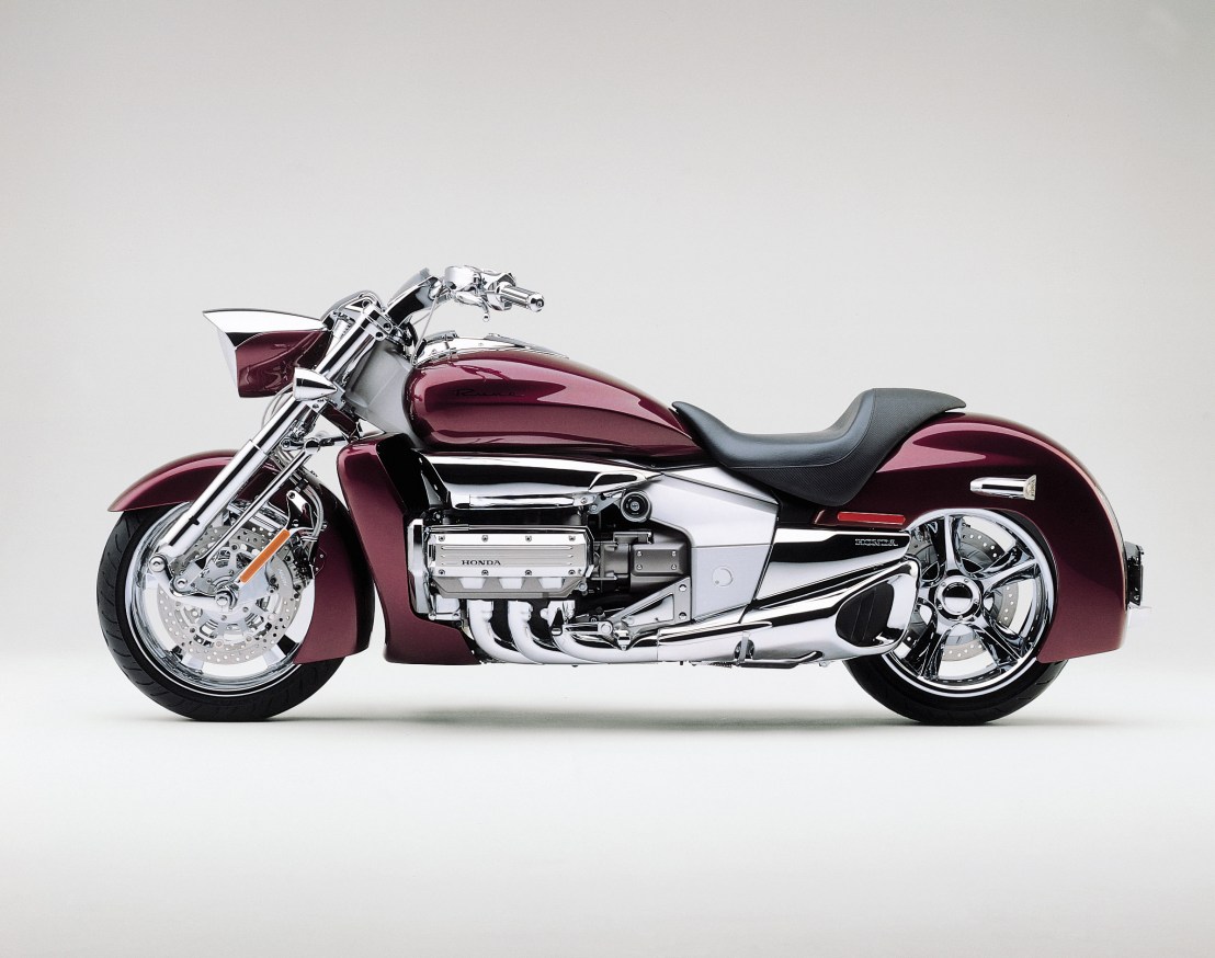
I love motorcycles. Actually, I love any vehicles that are nicely thought out in design, both in form and function. I had been riding dirt bikes since I was about 10 years old, and though I’d see a cool street bike (cruiser, chopper, or crotch rocket) every now and then, I really didn’t want one of my own — until a few years ago when I was at the local shop looking for my son’s first dirt bike. Sitting in the front of the store was this HUGE black and chrome beauty with swooping lines, lots of chrome, an art deco style radiator shroud akin to a 1930’s Cord 810, a swept rear fender, and a saddle you’d find on the finest thoroughbred race horse. On the seat was a huge sign “Do not Sit on Bike”. So I asked my manager buddy if I could. “Yep” was the answer, and a year later I had a candy black cherry beauty in my garage. 1835 CC engine, lots of cool, people always come up to ask what it is, etc. Honda made it for only 2 years between 2004 and 2005. They haven’t topped it since. 2004 Honda Rune

runefront

2004 Honda Rune

Comic-Con

Comic-Con seems to get bigger and more crowded each year, and this one was no exception. Lots of stuff to see, too many toys to drool over, too many people shoving their way past you. I would guess this is a lot like the streets of New York, but indoors and with lots of places for people traffic jams. As I mentioned in my previous post, I was going to interview Ragnar (aka Brandon Johnson), someone I consider a great artist/graphic designer of the mid-century/postmodern design aesthetic. His sources of inspiration include greats such as Le Corbusier, Walter Gropius, and Mies Van Der Rohe. Who can blame him? So, we went to Comic-Con, camcorder in hand, had a great interview. Got home and discovered the camera had some serious sound issues. So, I’m thinking of making a visit to Orange County CA sometime soon to redo the interview. Never got to interview Pascal- his booth was way too busy. Some other time I suppose as well.

Btw, if you’re looking for great postmodern furniture for your home that’s new, check out Plummers. They have some really cool, as well as really funky (if you’re into more of the early 70’s look) stuff.

If you don’t know Ragnar’s work, here’s some examples (posted with his permission). Click on the pic for a larger version:

Comic-Con First day

This Saturday I’ll be interviewing Brnadon Ragnar Johnson (Little Cartoons: http://www.littlecartoons.com/), and Pascal Campion (http://pascalcampion.com/), both incredible graphic designers/illustrators whose work is mid-century modern influenced, and posting those as videos as well.

On a side note, I ran into Jorge Garcia of Lost, aka Hurley. Asked him for a quick photo and he said no, though I had much better experience with other celebrities on the show floor, including Peter Mayhew (Chewbacca), Andy Serkis (Lord of The Rings), the voice talents from Clone Wars, and others. So I kinda thought Jorge isn’t as nice as the guy he portrays. His blog though was pretty nice concerning Comic Con: “Hey sorry if I didn’t take a picture with you when I was in the exhibit hall. It’s unfortunately too busy of a venue to accommodate everyone who wants a photo with me.”

Okay, I’ll let it slide. However I think they (the Con folks) should give some time for celebs to stop briefly for a 10 second photo. I do hope I can run into him though and tell him what a great job he’s doing on the show. One last season of Lost. Bummer. 

A Small Introduction

Being a designer by nature, among other things, I like seeing new design and old design, but no matter what, I like really good design. My favorite style for the time being is mid-century modern, both in architecture as well as in commercial graphic design. To be honest, that’s always called to me since I was a young child born in the early 60’s, before I even knew what design was. I think good design can be used anywhere, from places we eat, places we live, images we see, to products we use everyday. In this ongoing blog, I’ll be showing some of the stuff that really turns me on design wise, and once in a while point out designs I’ve found where I see things that can be improved upon. My background covers 30 years in design, from graphic design, to film, video, web, interactive multimedia, videogames and now products. I’ve seen a lot, designed a lot, and most certainly learned and matured a lot as a designer. You, the reader, are always more than welcome to comment on my thoughts, my designs I post once in a while, and general musings I make. Keep in mind the language here will be professional, no need to be mean, no flaming- just a good discussion on design. If you know of or see something you want to share, please do by all means!

Greg