This section represents some of the work I’ve done in user experience and interaction design. I’ve done everything now from web, to enterprise level work, to mobile (iPhone and Android), and tablets. The funny thing is, before Disney found my resumé online, and then called me up one day and told me they had an opening for a user experience designer about 5 years ago (which btw I never got the job…), I had never considered myself one. Yes, I can do user experience, but not from years in college studying HCI (human computer interaction), or Psych, or something else. When I went to school, there weren’t any degrees in UX or HCI, or aimed at how people work with computers.
For me it was something that came natural, and could do pretty well. As I sat at HP next to guys who had their Masters and phd’s, I was considered one of them and my input and solutions on complex problems were all welcomed and respected. All I studied in college was film, industrial design, photography, and architecture. Yet somehow I understand good user experience and interaction design.
I do have a lot more than I can show, but not online due to some things not being launched, or just general non-disclosure stuff. If you want to see more, then contact me and we’ll talk.
Trapster
I had the awesome opportunity to work with Team Trapster, the folks who created the iPhone/iPad and Android app “Trapster” back in the 4th quarter of 2012 and into 2013 before being wooed to work at a R&D thinktank called Applied Minds earlier this year. At Trapster, my main assignment was to redo all the UX and UI design for Trapster Android, and my secondary job was to create new product features.
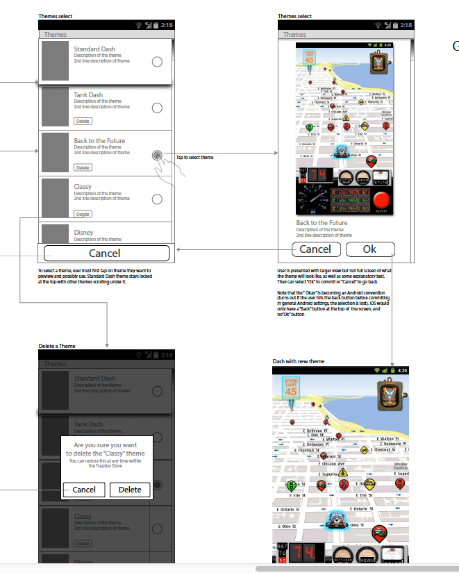
So, here’s some of the UX work including interaction designs.
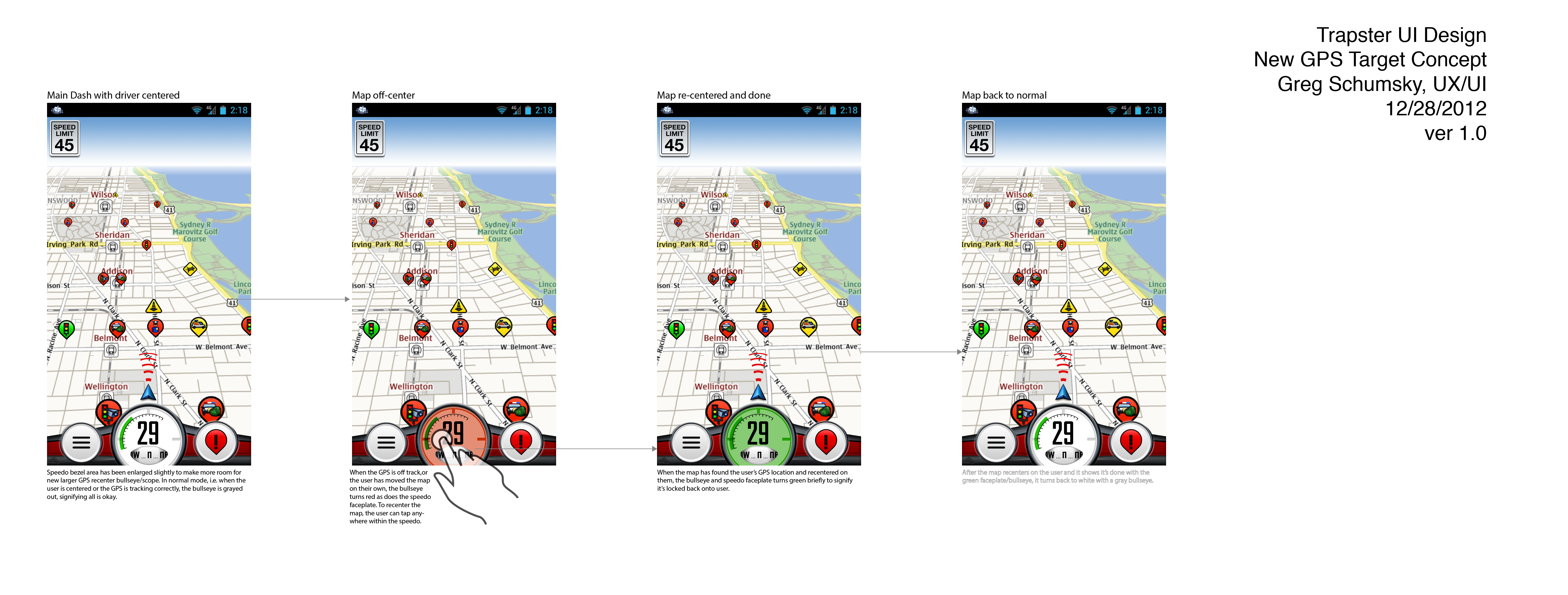 re-center where you are on the map
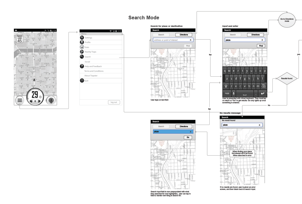
Interaction and wires for search and route
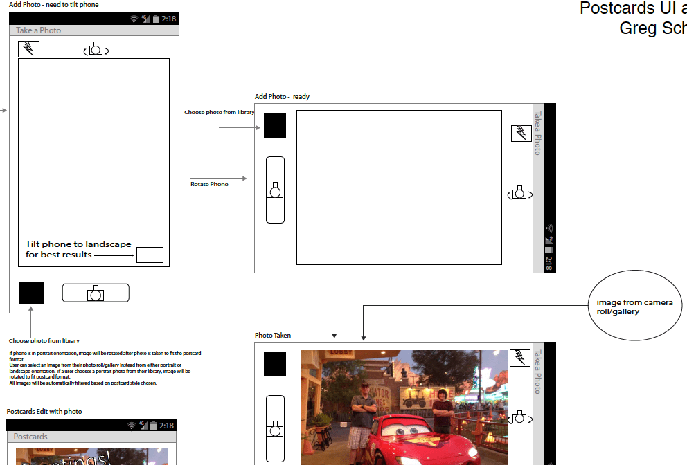
Postcards from the Road
Funny thing about doing UX and design in general, for me at least, is that sometimes I get to come up with a really great idea not because it’s part of a product roadmap, but because it’s something that I’m fully invested in due to something I want to create that could change the lives of millions, if not 10’s of people.
So the idea for Postcards from the Road came from something that I had recently experienced. My children had gone on a trip to Hawaii not too long before I made this, and had sent us some postcards from their different stops while there.
The problem was the postcards didn’t arrive here until the day they returned.
At Trapster, for each release train they’d do, they would give us a couple weeks to design and present new product features for the upcoming train. I did some research earlier on before working for Trapster to see if there were any postcard apps (there are of course), and if so how they worked or were what I was looking for specifically.
Being there were a handful of apps, I tried each one, and even though they were okay, they didn’t provide, to me at least, a stunningly awesome, I want to use this every single day, experience. Each one seemed to have one common flaw, to me at least. You had to still rely on the postal service to deliver the card to your intended recipient.
So I thought I’d design my own someday, and working for Trapster, I had the opportunity to at least design and present it, which was going to make it into an eventual release.
The Postcards from the Road feature (or app within an app), tied together three things I love: road trips, photography, and kitschy classic postcards.
With the app, the user would be able to take a photo anywhere with their smart phone, select a cool “front” of the card to go with the photo – from a series of built-in and downloadable templates, as well as add or edit the text on the front of the card. If they were at some landmark (Disneyland Cars Land for example), that would be pre-populated. Then they’d get to add a note, twitter style for the back of the card (postcards should be brief I think), and add as many recipients they’d like, using email and Facebook contacts.
The postcard would then arrive via email or FB to your addressee(s), and look like an actual postcard they could then save or print or put on their FB wall.
The wireframes and interaction design will show you how this all works.
Postcards wireframes and interaction design.
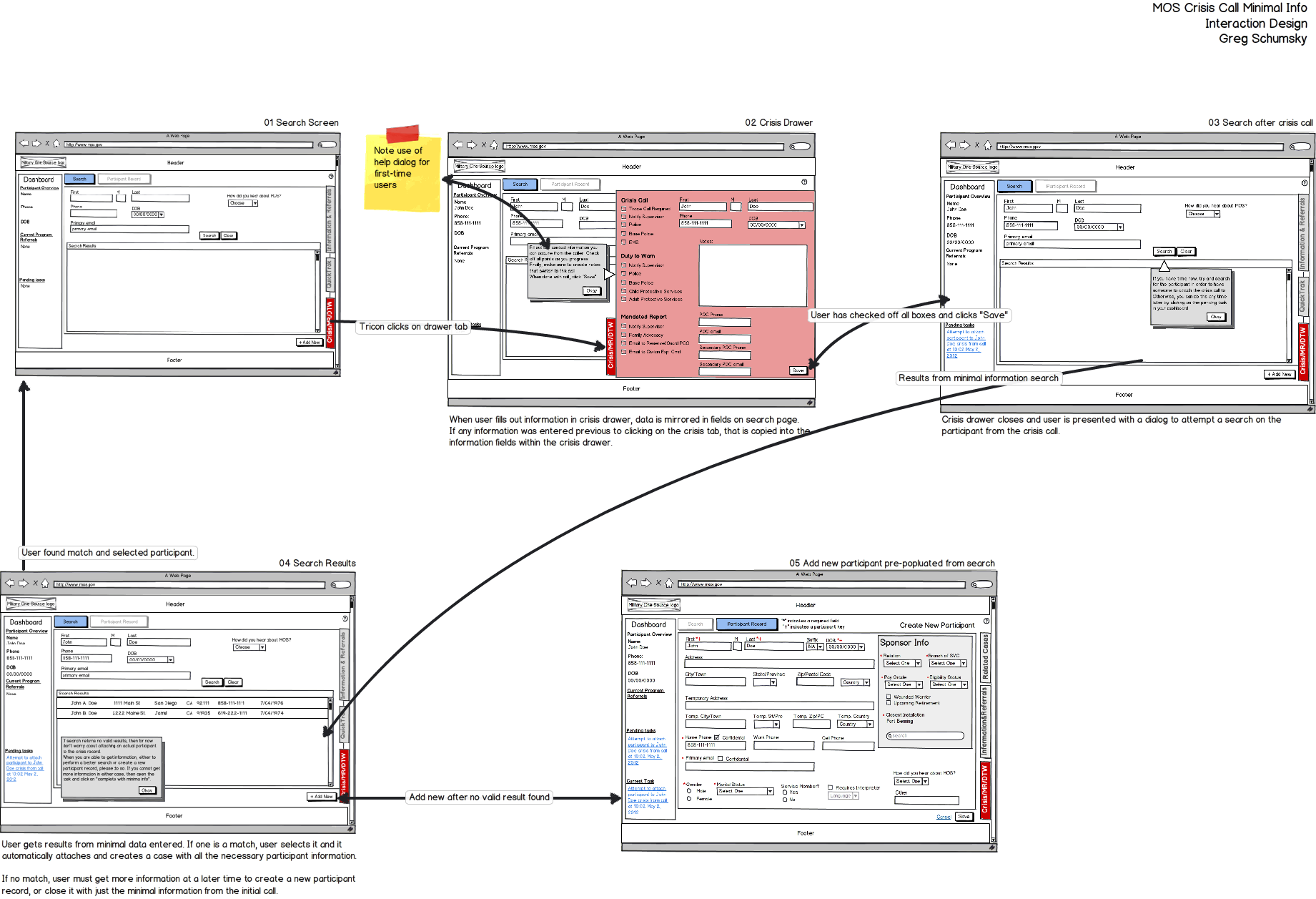
DefenseWeb
This is a small smattering of both wireframes and some visual mockups for an enterprise level web-app. Essentially, the idea was to have a call-center app that would be used by lots of staff, who would get calls from military personnel and their families for different services, including anything crisis related. As the sole UX guy, I never got to meet with any of the potential users, nor with the client, and had to go off the requirements that were gathered by the Product Owner — and this was a spec piece that was competing against other companies who wanted the huge contract as well. The good news – DefenseWeb got the contract.
The requirements were to be able to see the client’s name and data at all times, no matter what else was being shown or used by call-center staff, and generate various tickets from one interface and in the one call without the user having to create tons of tickets in different screens. My own requirements I had in my mind: Simple to use, elegant, not something that made the user’s job more of a chore, and of course, follow the other requirements.
I thought using different drawers with integrated tabs was a good solution. So did the client.
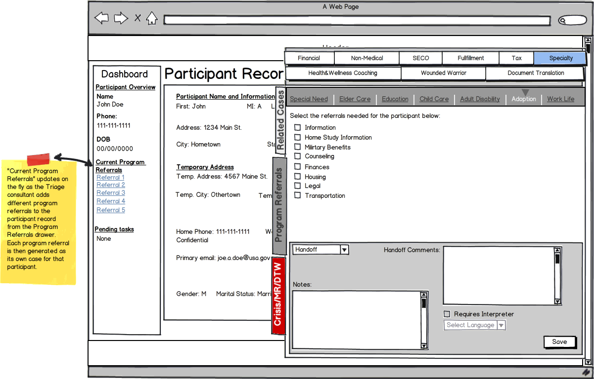
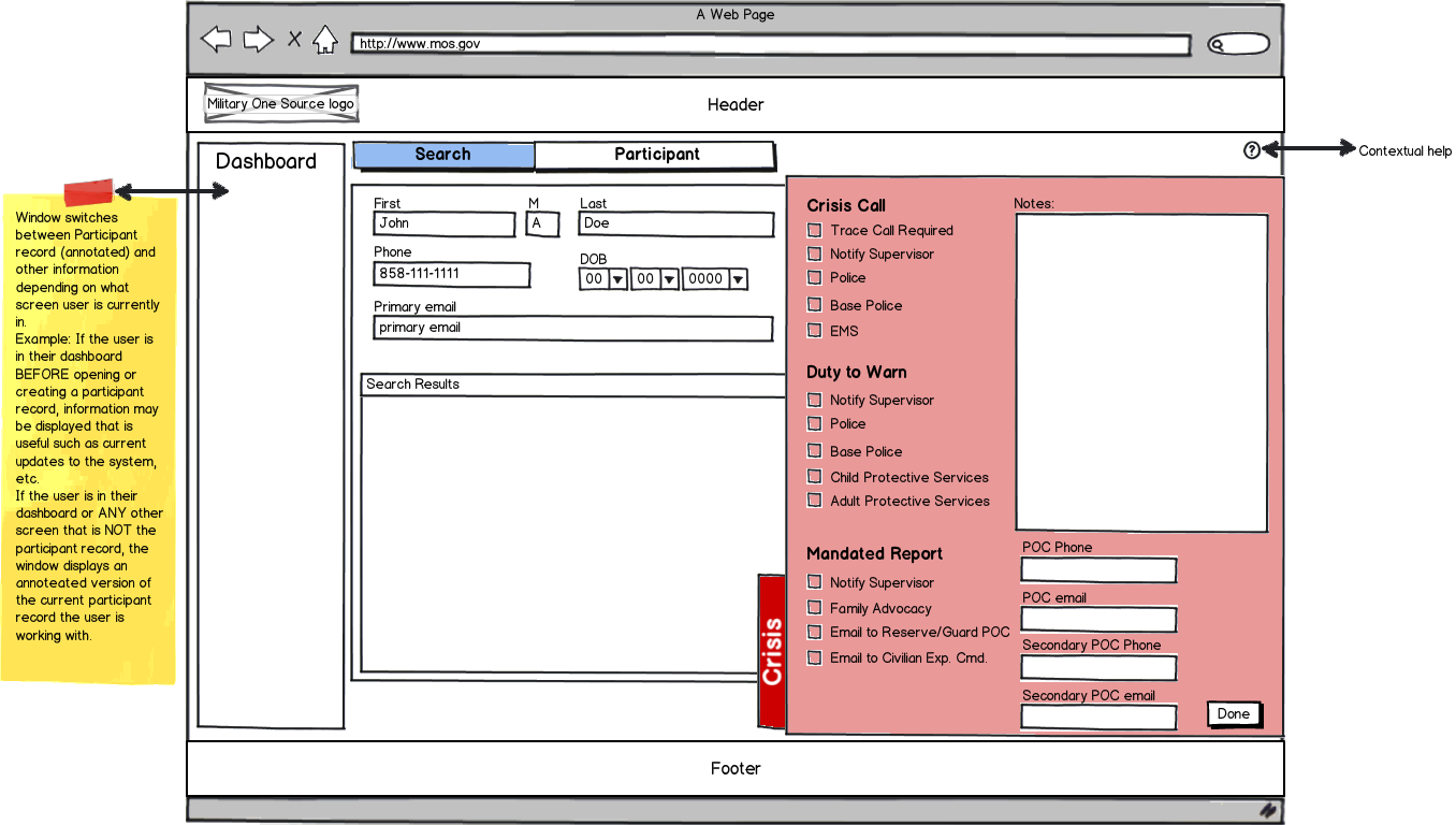

And to show I can do interaction design:
Hewlett-Packard
This is a small sample of the work I did while at HP on their web-enabled Touchsmart printers, which was a combination of user experience design, interaction design, as well as visual design.
Howcast print app
The first is one I’m pretty proud of, because it not only allows a user to print out “How To’s”, but each print is embedded with a MS Tag, which allows anyone with a smartphone and the MS Tag app to watch the corresponding video on their phone, providing a neat Augmented Reality experience.

Mappy print app
Mappy is the European equivalent of MapQuest. Trying to get ALL the features of the web version to work on a 2.5 inch touchscreen, and then give the users a nicer printout than what they were used to when using Mappy on their computers was the main goal, and a difficult problem to solve. These is are a few pages of 22 to map out (sorry), the functionality of such a complex app.


While one of my main tasks at HP was to create wireframes and flows, I also had to create brief user experience pitches for potential partners, as well as do the visual design work for interfaces.
This one is for a cartoon penguin named Pororo.


Ashford University
While at Bridgepoint Education I was responsible for the redesign of the Ashford University website. The site contains 463 pages, and we had 8 stakeholders who wanted their content to be presented the best way possible. For the wireframes, I went through roughly 5 iterations to the final version. I also created a user experience design brief, held the stakeholder interviews, and created a competitive landscape and deep-dive analysis for the site. You can check it out here: http://www.ashford.edu.
If you’d like to see all the research I did for the site, which includes interviews, a competitive landscape and analysis, and other fun tidbits of UX goodness, let me know and I’d be happy to share.
Some of the wireframes:


