Merry Christmas and Happy Holidays to everyone out there. I hope your Christmas (for those of you who celebrate it) was blessed and you had a good time with family and friends. I know we did.
One of the big things everyone does each Christmas is send out Christmas cards, and more recently, Christmas photos neatly printed out at Costco with some canned template and some nice wishes on the card. This year we decided to do something different by sending off a nice card with a family photo in it, that our friends and family could keep or frame or whatever, being appropriate all year long vs. the one month.
I mentioned in past post that my wife was finally letting us do the interior design of our house more in the mid-century modern style. For the past 10 years here, she had it decorated more in the country/shabby chic look. As much as I appreciate antiques, and I do think they can play a nice juxtaposition with mid-century modern, all shabby chic and cluttery stuff got to be too much. My wife Lisa saw that too, and decided it was time to go for a more clean, less is more look. So, we’ve been working on that in the house as time and money could afford. Anyone who has a set of Barcelona chairs they’d like to give to a good cause (us getting rid of bad design..), please drop me a line anytime…
For our Christmas decorating, we decided to use as our main tree a mid-60’s aluminum tinsel tree with some retro looking ornaments, some lights, and that was about it. For our family photo, we decided to dress semi-retro, all wearing our Converse Chucks. To add to the realism of the photo, I took the image into Photoshop to make it look like it was shot on an instamatic camera.
If this is something you’d like to try sometime, here’s what I did.
The original image looked like this:
The first step is load it into Photoshop and duplicate the layer 3 times.
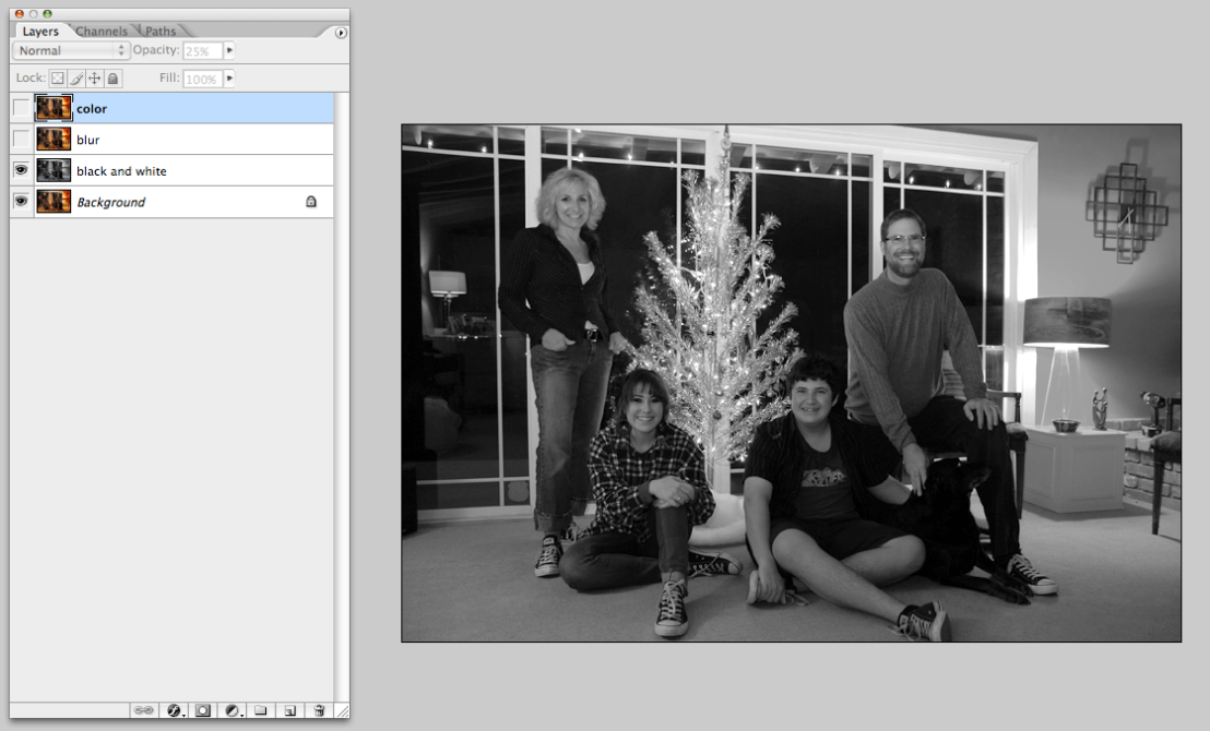
The first layer you make into a black and white image using the desaturate selection under image/adjustments/desaturate.
The next step is take the next layer up, and but it 2 or so pixels, depending on your own taste, then change the transparency to 50%.
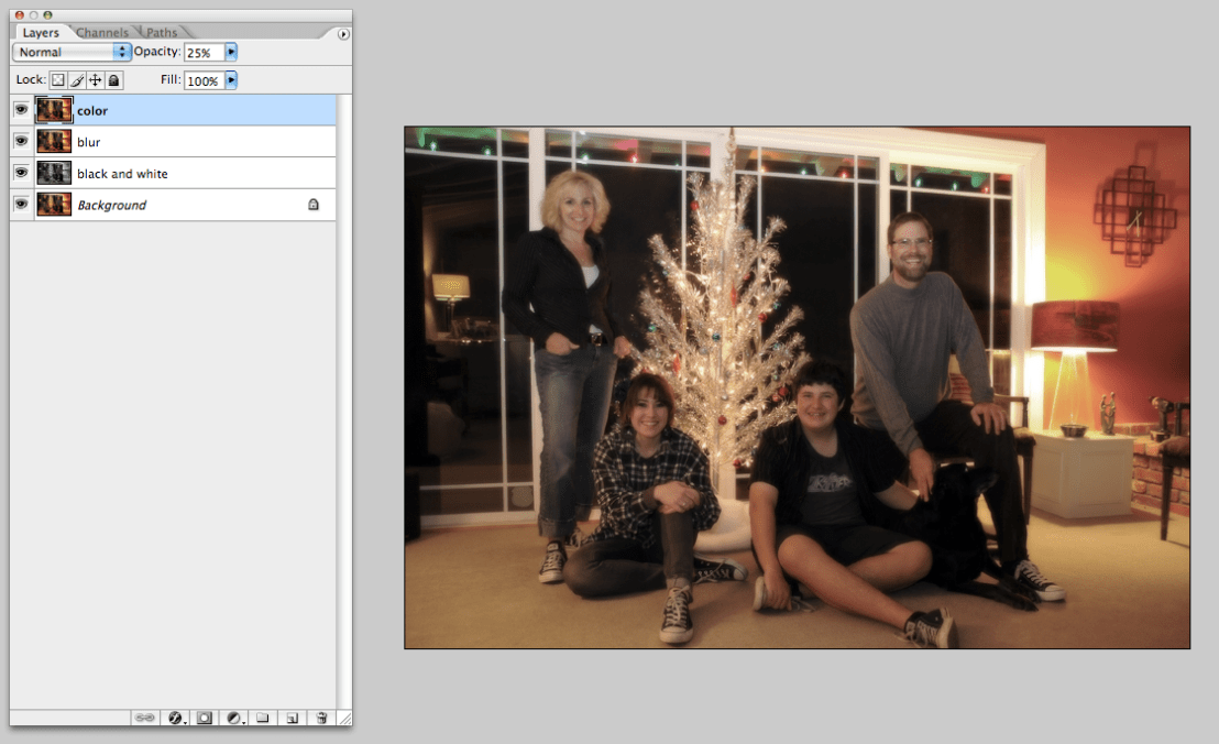
On the final top color layer, set the transparency to 25%. This brings some sharpness back to the image without losing the slight blurring.
And that’s pretty much it.
Below is a full before and after. Hope all of you have a Happy and Prosperous New Year!


