Category: User Experience Design

Random Thought – What Makes a Happy Experience?

Screen Shot 2016-03-31 at 11.55.18 AM

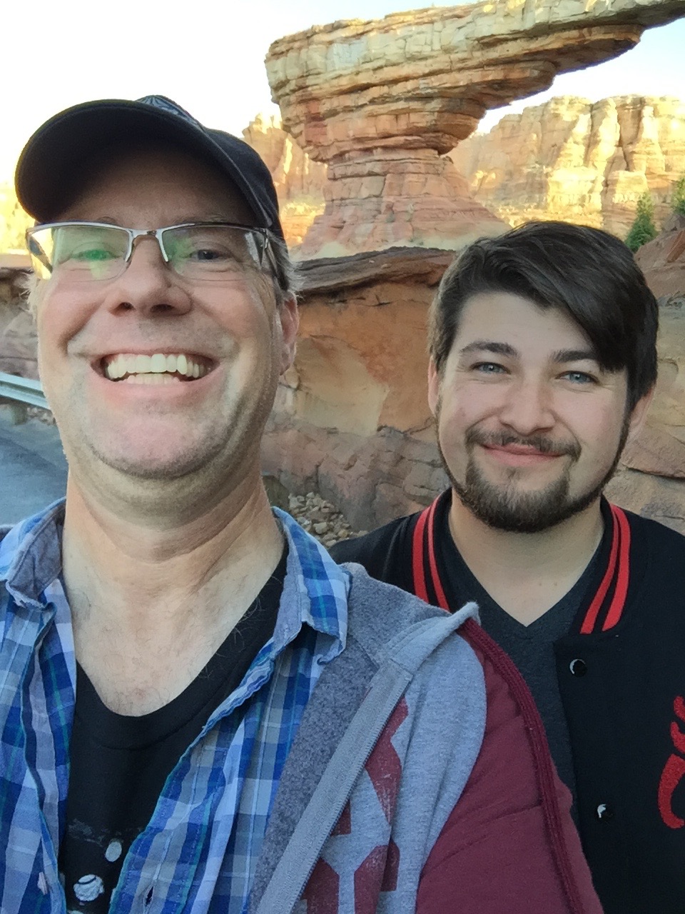
Yesterday — a Wednesday after Spring Break was supposed to be over, my 19 year old son and I made a 2 hour pilgrimage to the Disneyland Resort, or as we native Southern Californian’s call it, Disneyland.

I chose a Wednesday because it’s known as one of the lesser busy days. Add that I thought Spring Break was over, and it should have been a pretty slow day there. Lines should have been short, we should have been able to get on lots of rides, and moving from one area to the other should have been relatively simple.

It was, and it wasn’t. Turns out there was still a little bit of Spring Break going on, and everyone has been clued in that Wednesday is the slow day. (Turns out it’s TUESDAYS now).

Lines were anywhere from 25 minutes to 115 minutes (Radiator Springs Racers). But that was okay, as we planned on working around that, and a 65 minute line was bearable as it was a cool day out.

But the thing is, with all the people, lines, rides being stopped occasionally, it was still a great day and the title “Happiest Place on Earth” managed to live up to it’s name.

And that made me think why that is, from an experience designer’s point of view. I know nothing can ever be perfect, and there’s always room for improvement, whether it’s from an overall look at something, or down to the littlest of details.

As an experience designer, it’s my job (and that of fellow Experience Designers wherer they be a UX Designer, Interaction Designer, Information Architect, UX Researcher, Visual Designer, or theme park designer, producer, etc.), to create amazing, user-friendly, engaging, and even magical experiences for our audience.

In other words – A Happy Experience.

We know everything has room for improvement, and there’s never a point where something can be perfect. Walt Disney knew that, as he had said, basically, that he never wanted Disneyland to stay the same – he wanted to improve upon what first opened on July 17th, 1955. He knew it could only get better with time, technology, and the endless creativity of his Imagineers. But, Disneyland took what had been already done (amusement parks had been around for decades), and made it better.

Steve Jobs knew the iPhone wasn’t perfect, and there were plenty of mobile phones ahead of the iPhone, and even a couple smart phones. But Apple took what had been already done, and did it better. It wasn’t perfect, and will never be. But it’s overall a pretty good, to sometimes great, or even magical experience.

And it hit me yesterday as I was there at the park, what can make a Happy Experience, even among the crowds and lines. Same goes for apps we use, devices we interact with, etc.

It was the small details.  Things the experience designers come up with that make you, the audience, go “wow”, or smile, or anything that creates that moment of magic.  We know it’s not going to be perfect – what with budgets, deadlines, project timelines, and knowing there will always be a better way or better idea.

But we will always do our best to create those moments of magic.

It’s sometimes in the big things, but most of the time it’s in the little details.

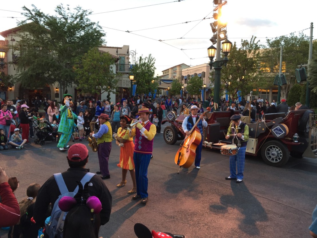
Getting a hug from a Wookie, or a watching a group of street performers give their all (and you know it’s probably been a long day for them) are some moments of magic that the Disney Imagineers think of.

IMG_4404

IMG_4438

And there are some that they don’t —  one’s that just happen.

Yesterday, there were a few magical moments for us, and I could see some for other park guests.  One of them for us was we decided to stop by the Main Street Train Station, as we knew the trains were not running due to the Star Wars Land expansion. We were headed to California Adventure, and decided to take a little detour.

As we made our way up the door to the station, it looked like they were closing, but the Castmember let us in. We got to see the replica of Walt’s own live steamer he ran at his house, and then went out the platform to see #4 with the Lily Belle car at the end.  There wasn’t  a lot of people, and so I started to take some nice photos of the train. I noticed nearby was one of the engineers tending to it, so I struck up a conversation with him.

IMG_4423

IMG_4424

My son and I learned a lot about the engine (it was built in 1929 and was used at a rock quarry), as well as the engineer’s background, and met another engineer who’s from San Diego, and got to chat with both of them as well as the conductor.

They even took a photo of my son and I from down on the tracks, and offered to take us on a tour next time we came back.

IMG_4428

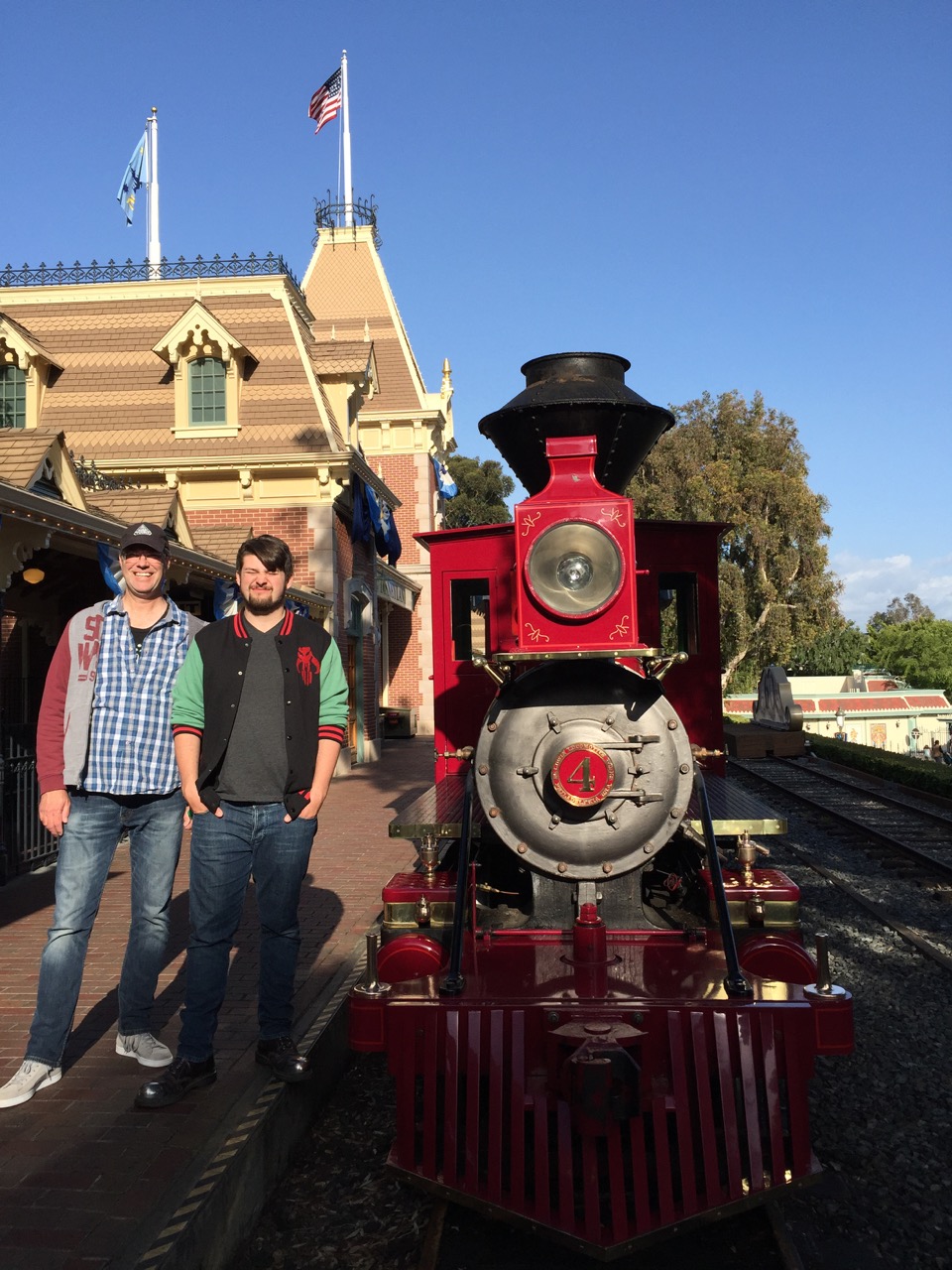
That was a magical moment — one I’m sure not a lot of people get, except those who take the time to get off the beaten track (no pun) and explore a little bit.

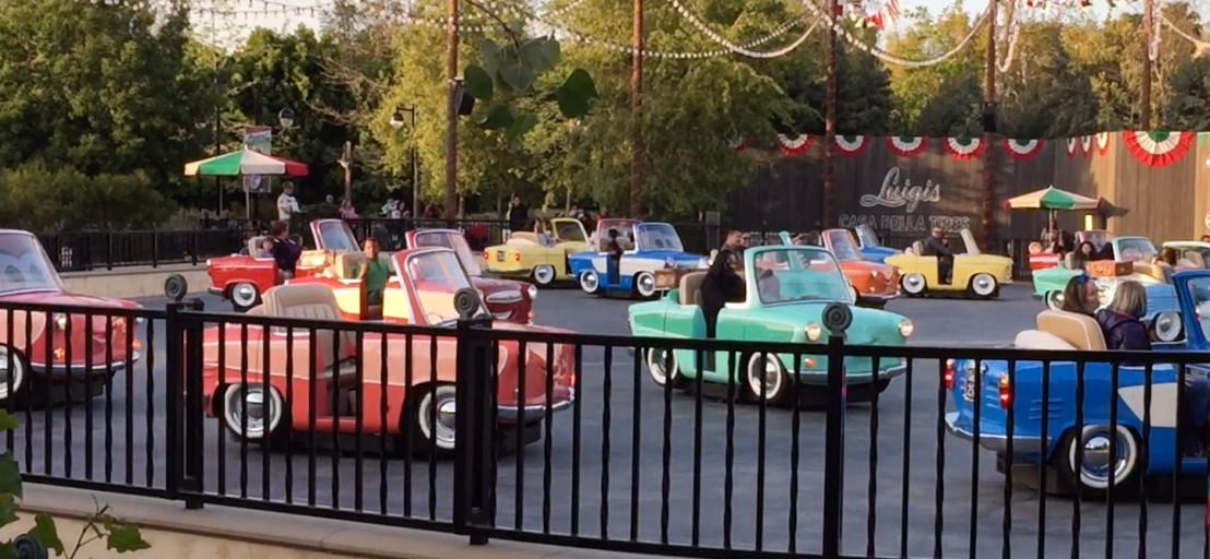
The next magical moment happened when we were ready to head home, and decided to check out the new Luigi’s Rollicking Roadsters ride. 45 minutes.

As we stood in line and finally were in the main queue outside the building to see what was going on, I could see a smile on my son’s face as he and I watched the other riders experience a random Italian dance performed by the cars.

And you could see the smiles, laughter, and children inside all the adults out there being children again.

That was magical. We all know life can be hard. As experience designers, it’s our purpose in life to make the things people have to do everyday that they necessarily don’t want to, magical.

If even for a moment.

Nothing is perfect, but we can do our best to make things a little more so.

IMG_4433


Random Thought – How does a UX designer become one?

I thought this round I’d post about an interesting conversation I had the other day with a fellow UX designer. I had invited him as well as a UI designer and his family over for dinner at our house- I had planned on grilling lots of good stuff outside with everyone being able to relax on the patio looking out at our expansive view, but being it was 105 outside at 5:00, well, my wife and I went with plan B by everyone just staying inside and doing barbecue indoors (crock pot and iron skillet..). And that worked out pretty well. But I digress.

The conversation was about how we all got involved in UX/UI design. My buddy Mark had studied Cognitive Science at UCSD. Zach and his family hadn’t arrived yet so I didn’t get to hear about his education. I commented that I was in fact a film student at UCSD (for a brief period) as I was working towards a film major (but with the dream of landing in Disney Imagineering as I loved to animate, draw, and engineer things), and that at the time I went there, they didn’t offer any classes in CogSci, or HCI, or Human Factors. As a matter of fact, no university was offering classes in anything computer/human related. No, I’m not that old.

Back in my day (which really wasn’t that long ago), we did have classes in computer science which consisted of BASIC, PASCAL, ForTran, and some other fun languages. So then the question came up of how I landed in UX Design, which is a good question. Being that my goal was to be a Disney Imagineer, I was reflecting yesterday how wonky my career path (and job history in general) has been, or at least seems to have been since the first job I had. But if I really look at where I am now, and know where I’m going to be eventually, then it all kind of makes sense.

So what’s my education in user experience design? Experience. Lots and lots of experience. My first job at 15 was as a video editor for a local TV real-estate show, and also working the front counter of the video rental business that was tied to it. That summer I worked as a graphic designer for a large sill-screen and T-shirt shop.  Then I went on to work for a mobile electronics shop (as in CB’s and car stereos) where I mostly did installs at 16, which then led to a retail job at a Radio Shack (when the employees knew electronics). That led to a job at Sea World, where I worked in retail (at Captain Kids ToyChest demoing magic tricks). I then ended up working at a pizza place- delivering pizzas, washing dishes, prepping food; and then another one at the same time. I then found myself working for 60 minute photo, which then led to a job working at a Famly Fun Center, where I fixed arcade machines, and occasionally had to dress up as a big Panda that loved miniature golf. Eventually I went back to Sea World to work in production in the entertainment department (I filmed the birth of a baby beluga which aired worldwide), and later with my comic robot for the beginning of Sea World Summer Nights), which then led to a job with a local TV station, and then a production company, and that led to a job working for the city schools as a multimedia production specialist. I also ended up teaching interactive multimedia at night school.

That led to a job with an interactive multimedia company as a programmer and project manager, which then led to me having my first company – a digital media studio, and that led to working in the web. And that led into industrial design (which I studied in college along with architecture). Which then led to working with designing ui’s and experiences for mobile devices as well as designing mobile devices. And then next thing I know I’m doing software design and interaction design at HP. Which lead to having a job as a real UX designer (okay, though I had been doing UX design already more than 10 years prior..). And now I’m designing UI’s for iOS and Android.

And that’s the experience I draw on every single day in order to create great experiences.


Random Thought (more or less) – Wake Up San Diego, UX is here

I read an interesting article posted this morning through the UX Professionals LinkedIn group, in regards to why UX salaries will continue to rise – the article is here.

It goes on to say that UX Designers and UX folk in general are in high demand but in short supply. Okay, I’ll buy that. I get that a lot from recruiters about how we are hard to find, especially good UX designers.

I’d say the software companies (custom solutions, government, video games, e-commerce) and retailers in the big markets get that, and the importance of UX design. Los Angeles, New York, Austin, Chicago, Seattle, Atlanta, the San Francisco surrounding bay area — they all get UX and covet the importance of having great user experiences designed. It’s mature in those areas. There are LOTS of openings for UX design folks in those places.

But somehow, the place I grew up in and love so much, San Diego, isn’t really getting it. I don’t know why, but it was kind of the same back when the web was forming. Those other places got it and San Diego was slow to the race. Okay, to be fair there are a few companies that get it, and there are single champions of UX in lots of companies shouting out loud how good UX is needed, the importance of it, and to the point of going hoarse because no one is really listening. In San Diego, for the most part, UX is a luxury. Most companies figure they have good developers who can code really well, and that’s good enough to get the job done.

The problem with that is even though developers make good code, they don’t have the insight to make a good product, or good customer experience. I often tell people that UX designers are like an architect and the developer is the builder. We listen to what a client wants and needs (we emote and listen to their feelings), and then design the perfect house or building (their app or website) for them. We design the plans, pick out the colors and furniture, or in some cases work with the interior designers to create a great experience. Then the builders come in, follow the plans, build it, and see the thoughts and vision come to life. THAT is one of the most amazing and rewarding parts of being a UX designer.

But a lot of companies are happy with having the builders. Until they hire or contract a UX designer. Then suddenly all the stuff they’ve built in the past pales in comparison to what the UX designer has created. And hopefully they get that UX design IS important. And sometimes they don’t.

So, when companies here in San Diego interview or are looking for a UX designer, most don’t seem to know what to look for. At least that’s been my experience as I’ve either worked on contract for, or interviewed at. Usually when I leave after an interview, it makes them consider really what UX is, and that they need to reassess their needs. The good thing is I’m helping them understand what UX design is. The bad thing is they then aren’t ready to hire – anyone.

Some want a UX designer who can do wireframes (check), interaction design (check), visual design (check) and program (uhh..). Okay, so three out of 4 ain’t bad. Some places I interviewed at have interviewed other UX designers who won’t even touch visual design (what??), and would rather farm it out (again, what????). Some want a UX designer who only wants to create wireframes… and some want them to come up with great ideas and leave all the other stuff to the experts.

So, I guess I’m not like a lot of UX designers, since I grew up drawing, designing, storytelling, engineering (you should see my plans for a flying Delorean..), taking really complicated things and making them simple, and yes, at one point even programming. Okay, so I don’t program now, but I get programming enough to know what can and can’t be done, to be able to look at code, or talk to coders and understand what they’re saying and respectfully speak their language enough that I don’t sound like some design lunatic. I can tell them what I want, point them to good examples, design out the kinetics so they get what the experience is supposed to be for the customer, user, audience.

I’m very passionate about great user experience design. And there are a lot of great user experience designers here in San Diego. It’s time companies stopped relying on doing so-so, “good enough” projects, whether they’re e-commerce, government, educational, consumer, marketing, or even entertainment based.

Time to wake up San Diego. UX is here and we’re ready to do great things.

And that’s my Random Thought for the day.

Greg – Renaissance something or other guy.

Random Thought- Responsive Web Design (an Analogy)

I thought I’d get this down somewhere, recorded in history before someone else claims they came up with it.

“What is it?” you ask. Once in a while, somehow I come up with clever thoughts and analogies for everyday things. Interestingly enough, someone in the office brought up the subject of responsive design,  and how difficult it is to do well, or at all. My thought and then answer was “Uh, no, it’s not.”

And to be truthful, really, it’s not, or shouldn’t be. Really.

It’s not that I was being cocky, or arrogant, or too sure of myself. I just feel deep down inside that people make a big deal a lot of times about things that are really quite simple, if you take the time to really look at them from a less-cluttered mind. Or even from the eyes of a child. I’m not saying one should be childish and immature. That gets you nowhere fast. But as designers, we need to be child-like at times – seeing things with wonderment and simplicity.

That afternoon I had an interview with a local creative agency to do some UX contract work, and the subject of responsive design came up again (coincidence?). The project would be for a pretty big web site, but had to happily live on the web, on a tablet, a smartphone, and even on someone’s big screen at home. So, the manager asked me what I think of, or more so, what does responsive design mean to me? How would I approach it?

My answer (and this is why I’m recording this for history): Responsive Design is pretty much the same as branding (if you worked in advertising or marketing you’ll get this – if not, then wait and you will). Take regular Coca-Cola as an example. It’s a good brand – everyone knows what to expect when they drink it, no matter if it’s from a bottle or can, i.e different packaging, but it’s the same exact experience.

So when designing a site, it needs to be the same exact experience — people need to feel like whether they’re on a smartphone or tablet or computer, there’s no shock in moving from one to another. And I truly believe in designing for the smallest thing first, where you don’t have a lot of real-estate, as well as people on the go want to get to what they want and need immediately. It’s good design. I highly recommend reading the 10 Principles of Good Design by Dieter Rams.  Or look at it this way. If you buy an 800 square foot house, are you going to buy a ton of furniture, or enough to make it a nice place to comfortably live? Also, think about what you need so that if you go up in square footage, it will work equally as well – but the idea is it still works and still feels like home. You might add on a few extra pieces to compliment what you already have, or lay it out a little different, but it’s still the same content.

Now that I have that recorded for all history, I can move on now.

Random Thought- Is UX Design a Novelty? (hint: the answer is no)

For the past six weeks or so, I’ve been working as a contract UX Designer for a company in America’s Finest City (that’s San Diego to those who don’t live or work here…).

When I was hired on, I was the second UX guy they had ever really met. The first guy, a super nice, stand-up guy who had worked for Sony online, had spent the last two years championing UX, and trying to get them to bring in someone to help with the load of work, being that the projects they were working on needed good UX, and it shows now in projects he didn’t have time to invest design thought into – being the sole UX person and there being dozens of developers and numerous projects doesn’t help.

I should have listened when he said he’d been trying for two years to get them onboard with user experience.

To them, from what I can see, UX is a novelty.

So, I design wireframes, and the developers as well as the visual designer kind of follow them. The visual designer sits pretty close to me, so I can provide art direction, since having been a visual designer, I know what works. And being that I’m seen as a non-typical UX Designer (I do visual design vs. sending it out to someone else), I think the whole UX thing is an end-to-end process, or should be and the UX Designer should know how to use Illustrator and Photoshop, and know how to design for the overall experience.

As far as keeping an eye on the devs, well, it’s not so easy, as we’re on a real tight schedule, and I’m cranking out wireframes as fast as they need them, since there really is very little luxury of getting any done ahead of upcoming sprints (this place is learning about and trying to be an Agile environment). As of now, there’s about 30-40 wireframes to do, 10 devs, and one me.

Because they’re not used to having UX (which I said shows on earlier projects), they come up with what they call “Developer Innovations”, as well as ignore affordances I put in the wireframes for a reason. Changing radio buttons to a drop-down list may not seem like a huge deal, but it is, especially if they don’t ask, and then the wireframes don’t match the app, and QA asks which is the right one (answer, my wireframes..). Or why is there more than one way to navigate to a specific screen (answer, because the button that allows it on one screen isn’t going to be on all the screens, yet the user still needs to get there somehow..heavy sigh).

I’m hoping that someday, UX Design will become standard, both in big companies as well as small ones. Users need good (well actually GREAT ) design. And it would be nice to be listened to, instead of getting that look from co-workers like I’m some crazy Uncle with crazy ideas. I talk, and they smile and just nod…

Design – Taking the Complicated and Making it Simple

I love to find ways to make something simple out of something that can be so complicated when it comes to designing an app or product. I just have this innate feeling that no matter how complicated something can be functionally, for the end user that something should be the most simple approach to create a great experience.

There’s some great examples of very complicated products or devices we use everyday, that in the end are a very simple solution for the end-user. The iPhone, the iPod, the iPad, a toaster, a clock, a pen, a mouse – and so on.

Usually in software development, a business case is made along with requirements, and sometimes those requirements are very complicated. I tend to have some crazy idea pop in my head (really!), especially when put on the spot and there’s no real time to do research, or flesh things out, that almost all the time solves a complicated problem in a very simple way. It’s something I’ve done since I was very small (I’m now very tall..), and maybe it comes from approaching things from both a user perspective, and sometimes a child-like innocence as well.

So it dawned on me today during a conversation to use a leaf as an analogy for design from both the complicated to simple.

To the average person (the user let’s say) a leaf is nice looking, pretty, leafy.

When the seasons change, it changes color- still leafy and pretty to the passerby.

And that’s the simplicity of a leaf- at least to the user.

Now for the fun part…

Ever look at a leaf up close? Really up close? There is a LOT of coding going on in one of those little guys. Complicated coding.

First off, look at all the structure. Lots and lots of structure. There is no mistake in what’s going on in a leaf. Next, it converts carbon dioxide into breathable air. Nothing else does this as easily or efficiently. Who thought of this? (answer: God)  And the whole changing colors thing? WOW!  Millions of people flock to the east coast to watch the changing of the colors…

So next time you’re designing and developing an app or product, think of the leaf.


UX Design- I Hate Web Forms (and forms in general)

Hello, it’s 2012, and I’m still filling out forms on the web, which is pretty much the same way it’s been since the web was invented, or at least started to catch on back in 1996-ish. Why are filling out forms on the web pretty much the same experience, i.e. BORING, as filling out forms on actual paper?

Recently, as in a couple days ago, I did my taxes using TurboTax. Now, I hate doing taxes, but actually loved the overall user experience of doing my taxes with it. Why? Doing taxes requires lots of forms. Complicated forms nonetheless. But TurboTax makes the experience of filling out forms actually enjoyable.

Back in 1996, when the web was on it’s way, interactive multimedia on CD-ROM was still king, and I worked for a company who produced CD-ROM’s for different industries, including hospitality. One of the projects we worked on included an RFQ form, that was to be filled out, printed and then faxed. Instead of the standard on-screen form with all the text fields and check boxes, we designed it to be interactive. We set it up so alll a user had to do was answer some questions, and then hit submit.

A finished, nicely formatted form was then produced so the user could print it and fax it- back then we didn’t have the abiltity to upload the form since FTP was pretty archaic and not what one would call user friendly by any stretch of the imagination. Still, the overall experience of filling out a form was better than it still is today in most cases.

Recently, as in a few months ago, I had the opportunity to interview with Disney’s Parks and Resorts Online group. During my interviews, they told me about a cool project that was done and now live, where there was the idea to get people to fill out an online form before going on a Disney cruise. Travelers could fill out the forms at the cruise terminal by hand, but by doing it online, they could save a lot of time.

So, to entice users to do the form online, they worked with the animation department to produce a short online video that harkens back to the old Goofy sports movies (it is Disney afterall), with Goofy giving examples of the advantages more or less of filling out the forms before heading off on vacation.

That to me was clever and overall a great idea. But some things stuck with me afterwards in regards to this and the overall user experience. Again, this is Disney, known world-wide for animation and Imagineering. Also, they are world class when it comes to the overall experience of their customers with the parks, products, films, and the like. So why entice users with a really fun animated piece only to fall short with a web form?

So consider this a freebie to Disney (Jay, Chris, Max), and well, to all the other companies out there who are forcing their users to fill out forms online using the standard tried and true method of filling out endless text boxes. Study and pick apart the TurboTax model of interaction. Doing taxes is serious stuff. But Intuit makes it a very pleasant experience.

To me they pretty much nail what an interactive form wizard (it basically is a nicely done wizard, the way a wizard should work – oh and being Disney, the experience is all about making things magical for their users…) should be. And while you’re making the form interactive, sprinkle in some Disney magic using Goofy, HTML5 and CSS3. Remember CD-ROM’s that had a person or character walk on screen to explain things or direct the user if need be?

What I dig about what Intuit is doing is we were doing this kind of stuff 16 years ago at a little interactive agency in what used to be a carriage house, and to see where it’s gone – although it’s taken a long time for some companies to catch on.

UX Design to me is the ideation, design and follow through in creating the overall EXPERIENCE – nothing should fall short of that. The problem with most things is I would consider them an “Almost there”, you know, like the Death Star trench run, only to have the missles impact on the surface and not hit the target. USE THE FORCE, LUKE.

Or, put another way, really think about what the end-user would want or truly enjoy. BE the end-user. Do you like filling out web forms? Probably not. We’re supposed to be thought leaders, game changers, usability Jedi Knights. We are supposed to make EVERYTHING a great experience.

Why Filmmakers Make Great UX Designers – An Opinion

I remember sitting in the cube of a manager at HP, as I was hired to originally make Flash prototypes of some new printer apps. As soon as I was hired (on contract), they asked me to do interaction design instead. So, weeks later, I find myself at the desk of the manager of the overall team. His question- ‘What is a user experience designer?’

I gave him an answer I thought was close enough. He pondered, then said something like “Yeah…but no on really knows what it is, and wherever you end up working, that company will think it’s something else.”

Okay, so I pondered that for a long time, and for the most part it’s true. UX, IX, Industrial Designers, information architects etc., all have something to do with user experience design. UX designers for the most part go to school to study human computer interaction (HCI), or Psychology, or end up spending $5k to take some classes for a week, take a test, and then end up with a piece of paper saying they’re a UX designer.

Then there are the people who never took classes, or spent $5k for a certificate. They just are almost naturally. And interestingly enough, there’s the off-chance that they have some background in filmmaking. Okay, so I happen to have been and still am at heart, a filmmaker. So I’m going to correlate  how closely UX design and filmmaking are almost the same thing. This is my opinion, which pretty means nothing. And you can argue points in this if you wish, tell me I’m wrong, or agree with me.

I’m not going to go all out on this, and will be somewhat brief, so bear with me and try to have an open mind. I’ll list something in UX terms, and then relate after how filmmaking is pretty much the same. Here we go…

UX Design Practice 1. Ethnographic Research

Ethnographic research in the terms of UX design simply put is studying a group of people, who are of some ethnic background, for months. You learn about them, interview them, spend time with them, get to know them well enough that you can make an informed study and thesis on them so when you go back to design something, it fits in with who the target users are. You understand them enough that you can now make a case study on that group and how to make your product work best for that group.

Filmmaking Version: 

As a storyteller or even documentary filmmaker, you spend months or even years interviewing, filming and learning about your subjects. You become part of them and considered to be one of them as you eat with them, share, and learn all you can so when you go back to edit your film, it best represents those people or group.


User Experience Practice 2: Creating Personas

Creating personas is the art of creating a fictitious person or character, including gender, general age, hobbies or interests and so on that would be the type of person who would use your app, or website, or product. Who they are, what they typically like to do, what drives them. It gives the illusion of a real live person that would for one reason or another want to use what you are designing.

Filmmaking Version: Character Development

As a storyteller, you create characters (personas) for your story, who they are, general age, gender, what drives them, and so on. You give an insight to them so they have depth when the story is written and then filmed.

User Experience Practice 3: Creating User Scenarios

Creating user scenarios for what you are designing towards is simply creating a story of a person (from a persona most likely), a problem they have, and how that problem gets solved ultimately by the app or website or product you are going to design. Example: Bob is a dad who’s busy all day at work, but needs to get things together for his family vacation with his wife and two kids. They’ve all decided on going on an Adventure by Disney to Europe, but he doesn’t have enough time at the office to make the reservations, his boss keeps piling on more work, and Bob is swamped with meetings and phone calls. So he grabs his smartphone while at lunch, goes to the Disney mobile travel guide, and within minutes he’s chosen the destination and booked the trip with a few clicks. When he gets home, he finds his trip confirmation on his HP web enabled printer at home.

Filmmaking Version: Writing the story

You write a story with a beginning, middle and end, add your protagonist (Bob), a seemingly insurmountable problem, give Bob a way to solve the problem, add some drama or some humor to the dialog, make it seem like he’ll never be able to accomplish his mission, add in an antagonist (his boss), but in the end he does and you wrap it up with a happy ending…or he gets home to find his printer is out of ink, added with the “…to be continued” tagline.

These are only a few examples of how user experience design is very similar to filmmaking.  If you have some, please share them. I’d go on, but I think I’ve given enough examples for now.

Greg

User Experience Design — What is it?

This question seems to come up often. Not just from people who ask me what it is when I tell them what I currently do for a living- “You’re a what?” or “What kind of designer?” or more often just a puzzled look from people like deer in oncoming headlights.

However, this question was posed to me by a past boss (well, he was the manager of the department I worked for when contracting with HP, so he was kind of a boss for me). His question was “What is User Experience Design?”, to which I gave him some pat answer about how UX folks look at software (which I was doing at that time) and figure out how to make it a more engaging and user-centered or user-friendly experience, whether it was a website or mobile app, or software you use on your computer.

His response – user experience design is much more than that, and it mean something different to different people. The problem is I gave him the answer I thought he wanted to hear, since I was hired to do software design (both interaction design and user experience design), and wanted to show I knew what I was doing. However, my mind and heart always believed it went way beyond that.

There’s been a lot of talk or words thrown about in regards to user experience design, or even user-centered design. And as I mentioned earlier, most people think it falls into software or web design. To some degree, that’s where it is needed a lot — there are too many websites and apps that just don’t work. Not just little small company sites, but huge sites that belong to mega-corporations.

But I believe that UX touches everything we do, or at least it should. When people say to me “A what?”, my answer is that we, as user experience designers, find ways to make the things people use everyday easier, simpler, and more engaging. That can be an app, a website, a device, a product, theme park attractions (and even the theme park itself, which is the main attraction), vehicles, a coffee cup, luggage for your motorcycle (I mention this because I designed aerodynamic luggage for motorcycles), and other everyday things we encounter and use all the time.

I believe in all that. My desire is to be doing any of those whenever and wherever needed. My brain is always on go, thinking of the next cool thing or how something can be made better, whether it’s something as simple as a stapler, to something as big as an attraction at Disneyland. I want to be known as an Experience Inventor.

The problem is people see my resumé, or my profile on LinkedIn, and peg me as someone with a lot of IT experience and think my goal is to be a user experience designer in IT/apps/software. And to be honest, there have been a number of jobs I’ve had that are IT based. But there’s also film work and video production which were my first loves, but I had a knack to change with the times as interactive multimedia and then the web surfaced, and I survived and adapted.

Yes, I know IT pretty well. I like working in IT, and doing user experience design in app development. The majority of my friends I have known for a long time all think  I should be an Imagineer – they’ve seen the entertainment robot I built when I was 15 (and had a pretty good business running at Sea World, local malls, and parties in La Jolla), my video and animation work, my photography, graphic design work, and currently my full-size interactive replica of R2D2 that I’m working on.

The bible says “I can do all things through Him.”  To me that has always been true. I have no other way to explain how I’ve been able to learn things quickly, adapt to jobs I’ve never done, succeed in everything I’ve attempted when I probably should have never attempted things in the first place. I’m an inventor, creator, designer, entrepreneur, problem-solver and more.

I’m Greg Schumsky- Experience Designer  Inventor.

And thank you for taking time to read this post.


UxD- more or less

I don’t really know if this falls under product design or user experience design.

Today I stopped at my local AM/PM to get gas — $3.17 a gallon for Premium. Not bad. Not great, but not bad. As I slipped my ATM card into the pump’s interface, it asked if I agreed to the .45 cent charge. On the keypad next to the flat (i.e. not raised like the rest of the keypad) green “okay” label is the actual key with the number 1 on it. So I hit it and it took me to the next screen – “Do you want to buy a carwash”. Next to the flat red “No” is the number 4 on the keypad. So, being that the 1 on the keypad worked, naturally the 4 should as well.

As computer users, and just users of technology devices that have contextual menus, the keypad could either be used to enter one’s PIN or ZIP code, or in this case, act as the yes and no keys, as well as cancel (which was a flat yellow label next to the physical “Clear” button). So I pressed the number 4, or what I assumed to be NO…and pressed, and pressed. Nothing happened. “Do you want to buy a car wash” was still on screen, as though the pump had a camera, some for of AI, and saw my dirty yellow car (I live on a dirt road, so, well, you get the picture).

So I go in the store. “You have to touch the ‘No” button” the attendant informs me. So I go back out. Hmm, no “No” button. What if..? So I insert my card, this time trying the green label– AHA! It’s a membrane button. Same with the No button. Okay. So I get that they wanted separate  buttons for these actions. Good idea, bad follow through. Below is a graphic I put together of what they have and what I think they should have instead..

Put the buttons somewhere else

Of course there are other ways to do this and this is only one of many solutions. Whoever designed the current implementation should not be working as a designer, and most likely they aren’t anyway.

So next time you get gas, check to see if what looks like a label is actually a button.