I like minimalistic design, classic lines, nice edges. I think the new iOS7 is getting there as it got rid of ornamentation (glass effects, big drop shadows, shiny stuff), in favor of clean lines, a more layered look with flat icons, and outlined icons as well – stuff that tells the user what it is without being showy.
Earlier this year, Disney changed their website, and I really like it. In the past, it was big, hard to navigate, worked horribly on mobile devices, took a long time to load, and was very showy.
This was the old site – screengrab from thefoxisblack blog:
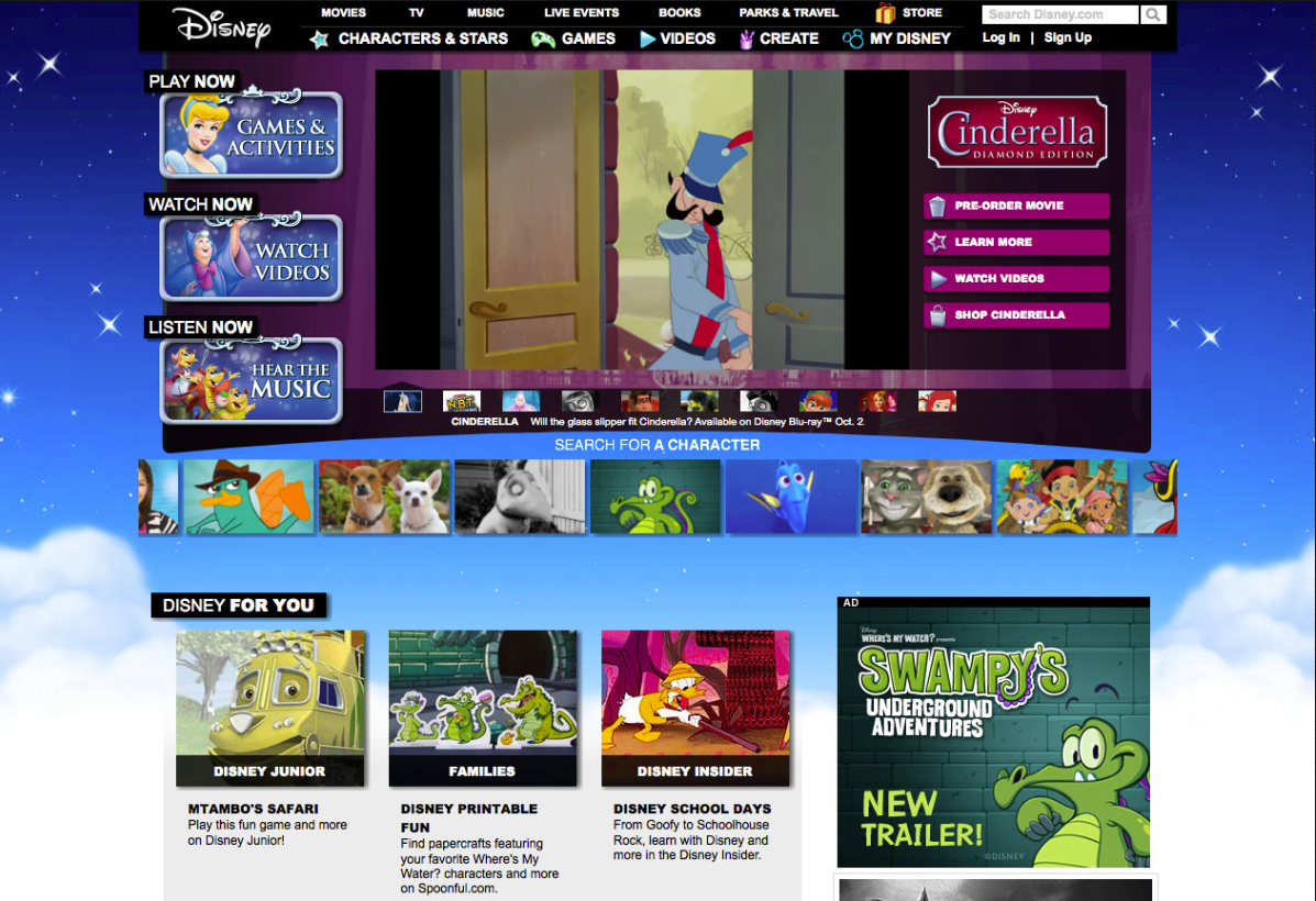
I’d say there was a certain charm, but the site was outdated, felt like it was from earlier in the century and hadn’t been redesigned in ages, and again was difficult to navigate.
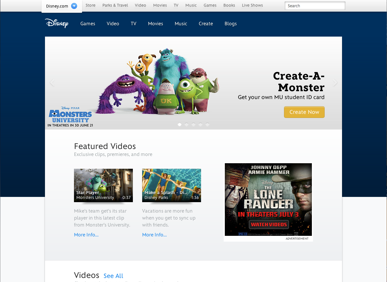
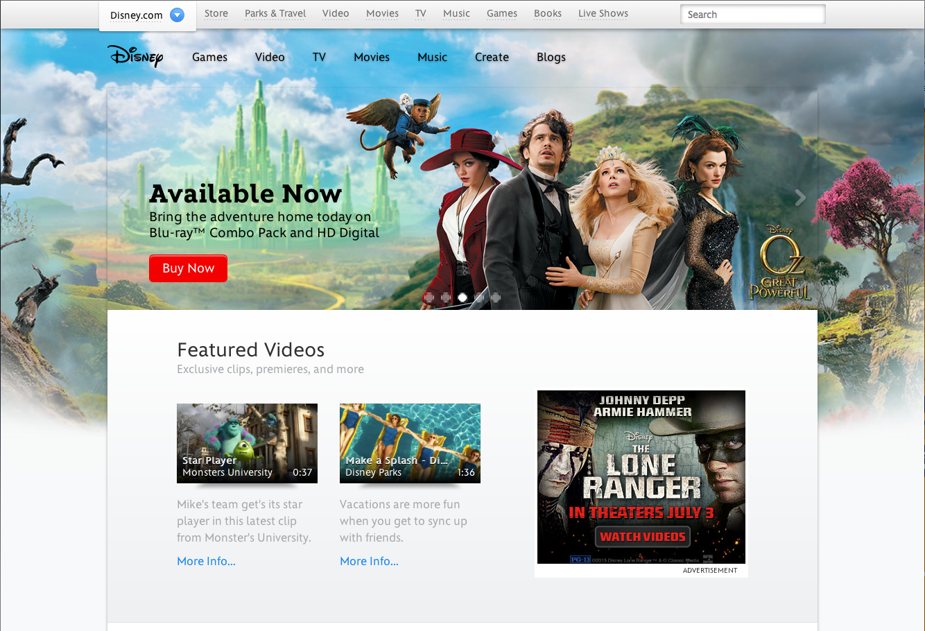
The new site changed that. It put content and usability ahead of flashy design. It lets the content – videos, characters, parks, etc. be the main focal point.
Some examples of the home page:
Good example of responsive design. On my iPhone with the section below, the icons are nice and big, and I can scroll horizontally through them.

In today’s web/information/social media world, responsive design is very important. I don’t think it’s frugal — both time and money-wise, to design different versions of a site for different viewing experiences.
I understand that doing responsive design isn’t easy, and there are sometimes where a mobile version of a site must be done in order to provide the perfect experience for the user. Examples would be a banking or credit card site, or basically anything that requires lots of input from the user.
Content-rich sites that are getting updated all the time would be a costly endeavor for any company if they had to update that content on various platforms – even if the content is dynamically driven so it’s publish once, the cost of time and effort to architect and design for all the various platforms and screen sizes could be insurmountable for most – even big corporations need to be smart in their spending (I’ve seen a lot of waste in a lot of the big corps I’ve worked at).
So what does this mean for the end-user?
A buddy of mine and a lot of people didn’t like what was done with the Disney site, and I was told site visitors dropped off. But I think once people get used to the world getting away from ornamentation, drop shadows, bevels, lens flares, glass effects, and so on, then they’ll begin to embrace simplicity, speed, ease of use.
Dieter Rams said this: “Good design is as little design as possible — Less is more – because it concentrates on the essential aspects and the products are not burdened with non-essentials. Back to purity, back to simplicity.”
It’s time we got back to clean and lean design.
- Uncategorized
