Like most Americans, I like an occasional burger from some fast food joint, whether it be McDonald’s, Jack in the Box, Carl’s Jr. or Wendy’s. Being this is a design blog, I won’t comment on the food. Everyone knows pretty much what to expect from these fine dining establishments.
What I want to focus on here is architecture, and more important, how these businesses can use it to generate customer visits. Over the past 10’s of years, buildings that were once unique and part of a fast food chain’s brand, eventually became 4 walls and a drive-thru, and designed to be inexpensive to build, and in some cases, forced to fit in with a shopping center that they were being placed in. This is pretty typical in San Diego.
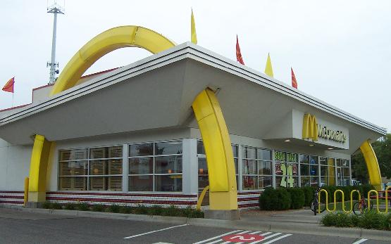
So, first up is McDonald’s. They started with a very cool design back when it was owned by the McDonald brothers, and decided to bring that back in their new restaurants to commemorate the 50th anniversary of the chain. What I like is the cool retro, Jetson’s Space Age kind of look to them. It makes me want to go in and buy a burger, even though I really want a Sourdough Jack..

Anyone familiar with Jack in the Box that’s not over 30 (maybe 40?) years old knows their eateries to look kind of like this:

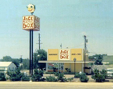
Jack in the Box needs to go old school I think in order to compete with McDonald’s. I really miss the actual sign that was a Jack in the Box…

That’s my .02 cents. What do you think? In the meantime, I’m going to go grab both a Big Mac and a Jumbo Jack.